
Cüneyt Onur – Özge Kadayıfcı
Plan Reading · OT Kafe Çanakkale
Good design is design that proves itself while it is working.
Colour and material are the notes; design is the whole composition.
In short Restaurant design should begin with an analysis that reads the space, the business, the guest and the brand together. Every decision, from layout to light, should be part of a single architectural composition that carries them all at once. OT Kafe Çanakkale is an example of this approach: from the service flow to the height of the chandeliers, from six lighting scenarios to the repetition of a fabric, every decision grew out of that composition.
Reading four things at once
For us, analysis is not measuring a space; it is hearing the notes no one sees: reading the space, the business, the guest and the brand at the same time. Considered separately, they produce spaces that are either beautiful but don't work, or work but have no soul.
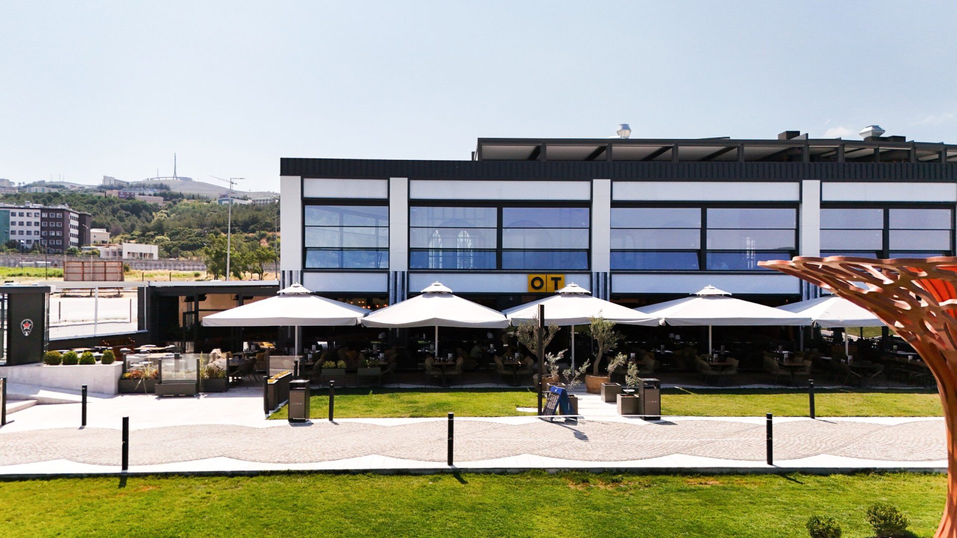
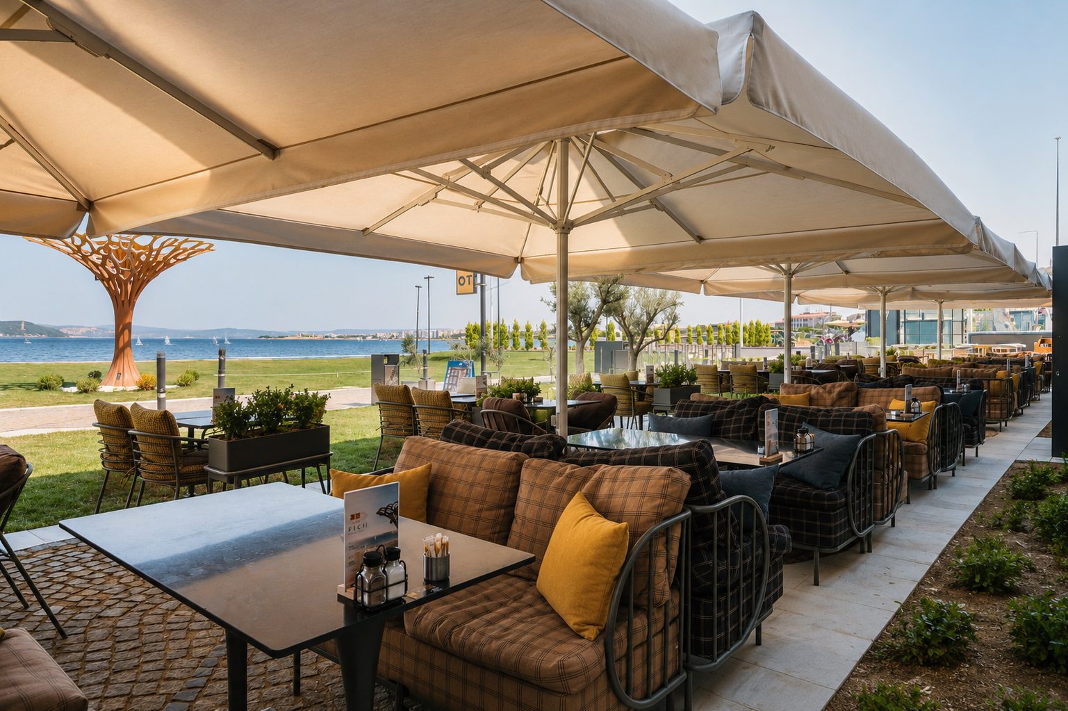
In front of us was perhaps the most beautiful view in Çanakkale: an open green space ahead, the whole length of the Dardanelles beyond it, and directly across the water the Dur Yolcu (Stop, Traveller) Memorial. What we were handed was an empty shell. The ventilation outlet was at the very back, and the ceiling was 420 cm high. The goal was a business that would host 326 people. The brand was OT, built around humour and literature, with the motto "it's all about good conversation". The space would welcome both local residents and the brand's long-standing readership.
None of these parameters came before the others. Putting a kitchen on the view would have sunk the space. But giving the sea to the guests, or setting up a flawless service flow, would not have brought success on its own either. These decisions only gain meaning within an architectural design: how the volume is composed, how light is used, the texture of materials, proportions and the feeling the guest experiences. The hard part is finding the one composition that carries them all at once.
Gathering into a single theme
The concept gathers everything that comes out of the analysis into a single theme. That theme defines the feeling the space will convey, the design language, and the language of light and material. Layout is part of the theme too: the number, type and arrangement of tables grow out of the product itself, the service model and the guest's expectations.
In Çanakkale, the feeling we were after was a single sentence: "I belong here." We wanted guests to feel good and happy, to say "this place is me, I collect good moments here". But we wanted the architecture to say it, not a sign reading "this place is made for you". We think about, debate and construct this sense of belonging with great care. But this feeling, too, is built not with a single element but with the whole.
Distributing the theme among the instruments
Design distributes the theme among the instruments: layout, service flow, volume, light, material, furniture. None of these elements is considered apart from the others. Let's look closely at three of them in Çanakkale.
Layout and service system
We planned the dining room together with the service areas.
- GoodsEnter through a separate door and go from there to the cold rooms, storage and prep.
- Cooking and dishwashingBack to back, but separate rooms for hygiene.
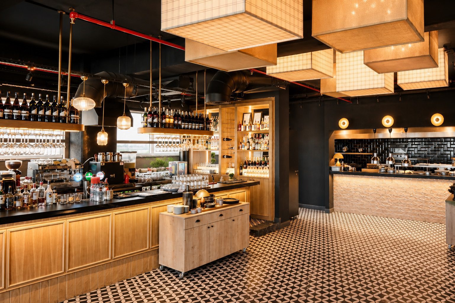
- BarThe bottle coolers behind it hold three days' supply. The store for high-value stock is in the staff corridor. The bar faces two ways: the dining room inside, and the side garden terrace through an opening panel.
- Cleaning roomNext to the guest toilets: close to the areas cleaned most often, and sharing the same plumbing line as the toilets.
- StaffStaff come in through the guest entrance in their own clothes, go to their own corridor, and only step into the dining room in uniform.
- KitchenThe ventilation was at the back, but we deliberately brought the kitchen forward and made it semi-open. It became a stage opening onto the dining room, and the distance to the service counter shrank: food reaches the table hot, and staff walk less, which shows up directly in operating costs over time.
Volume, chandeliers and rhythm
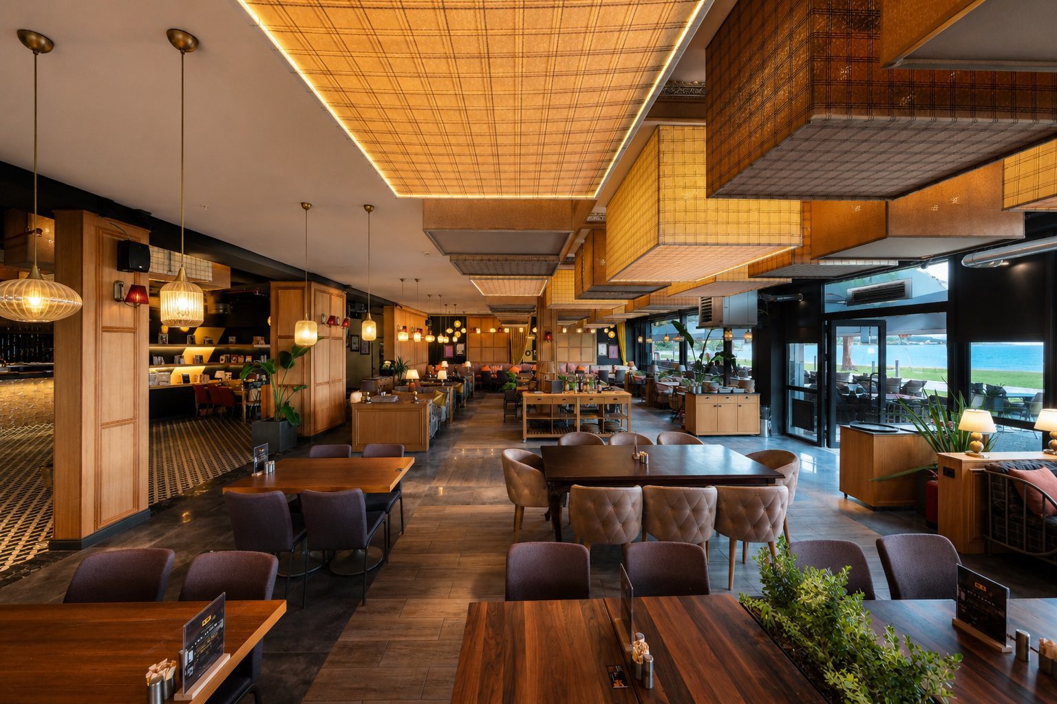
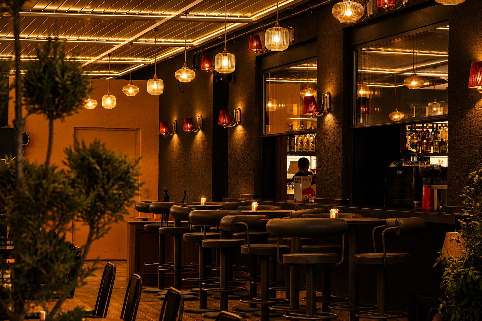
A 420 cm ceiling gives prestige, but it can detach people from their sense of scale and it amplifies sound. The 80×180×80 cm chandeliers, hung at different heights and in different sizes, are a shared answer to these questions. They cast a warm light over the tables, build a third dimension within the volume that brings the proportions close to human scale, and break up sound. Acoustics is not something we solve afterwards; for a brand whose motto is "it's all about good conversation", people being able to hear each other easily is the design itself. In some places we deliberately left the ceiling open, because the prestige of a tall volume is part of this space too. The chandeliers' fabric is repeated on the armchairs, and that repetition gives the space a rhythm.
Light: six scenarios
Light is set against the light outside. There are six scenarios for six moments of the day. In the morning, the areas by the glass and at the very back are lit so the interior can be seen from outside. At midday the light opens up a little more. In the late afternoon the lights in the enclosed area come fully on, so the strong sun off the Dardanelles doesn't wash out the atmosphere inside. As it gets dark, the light is dimmed rather than raised: with two separate scenarios, one as the sun sets and one after sunset, the space turns into a true evening dining setting.
Each lighting group can be dimmed alternately within itself, so the rhythm holds as the light falls. The round yellow wall lights from OT's earlier identity and the burgundy fabric wall lights stay on all day.
Behind the booths there are table lamps. They give both privacy and the feeling of a sheltered seat. And in the evening, when the dining room is dimmed right down, they light the table and the food. Because the light hits the fabric shade first, it never falls on the face: soft, but exactly as much as needed.
Colour, furniture, solid and void
Colour comes from the brand's memory: the yellow diagonal stripes on a black ground and the round wall lights greet earlier OT branches, and the burgundy fabric wall lights complete that language. The furniture is not uniform; booths, group tables with quilted chairs, a work corner by the library and bistro seating in front of the bar make room for different guests and different lengths of stay. Solid and void were designed too: areas filled with chandeliers and areas where the ceiling was deliberately left open separate denser and airier zones within the same volume. The curtain isn't there because someone said "let's hang a curtain here too"; it tells a story. Like a theatre curtain rising, OT appearing between two curtains tells of the brand's rebirth: "And curtain up…" the New OT takes the stage. Repeating from different angles, the motif carries this story into every corner, giving the space both continuity and depth.
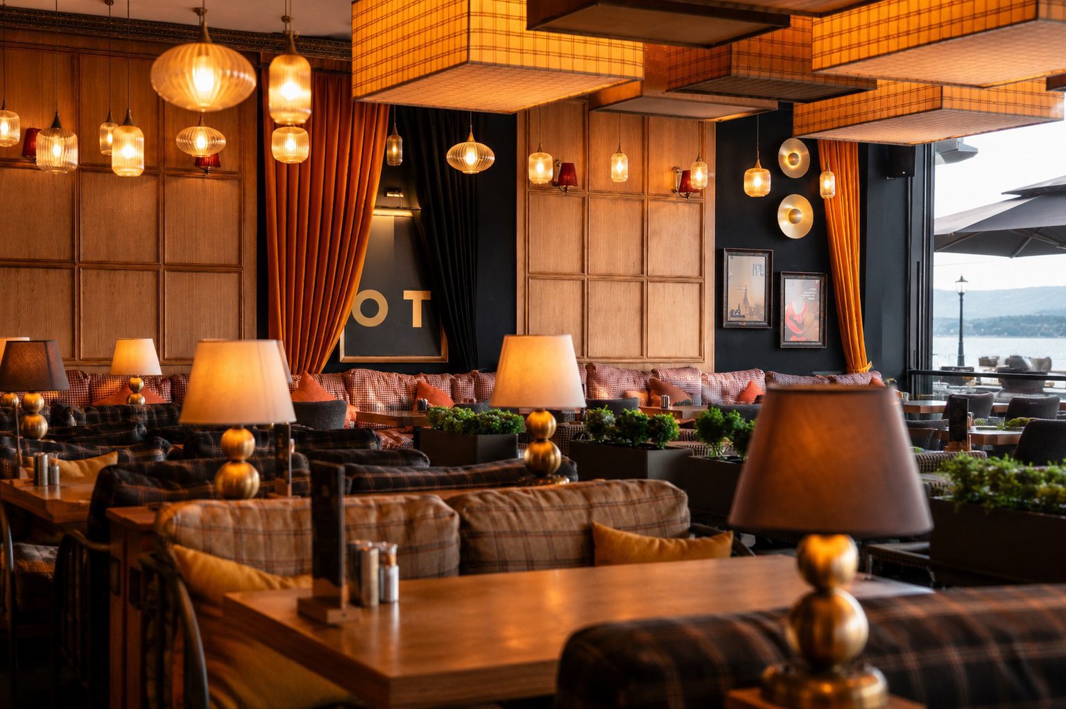

None of these elements tells the guest "this place is made for you". What guests see: walls, solid and void, volume, colour, material, furniture, chandeliers, the repeated fabric and light. What they don't see: the service flow, acoustics and the whole system working behind the scenes. All of them exist together within the same architectural design to build one overall rhythm. Our whole effort is so that guests, without noticing that rhythm, can say to themselves: "this place is me".
Building the design on site, in full
Design is complete only when it is fully built on site. That is why we see implementation as part of design.
Design took 40 days. Implementation took 110 days and ran in parallel with the design. The site work fell in a period of heavy rain, mud and cold. Even so, we handed the space over fully turnkey and ready to use.
A harmony without a name
The outcome is a harmony guests can't name but can feel.
On fine days guests sit under the umbrellas on the sea front. In wind or rain, or on the busiest weekends, the side garden comes into play. Since opening, the business has not had a single negative comment about the service flow. On the contrary, the manager personally praised the separation of the kitchen, bar, dishwashing and staff areas, and above all the comfort and order of the staff dining and rest area.
The position of the kitchen, the height of a chandelier, the repetition of a fabric, the light of a table lamp, the location of a cleaning room. None of them says anything on its own.
The value of a composition lies not in the number of its notes, but in the relationships between them.
Frequently Asked Questions
Not with a table plan or decoration, but with an analysis that reads the space, the business, the guest and the brand together. First you need to understand what each of these four parameters needs and how they affect one another. Decisions on layout, service flow, light and material should only be made after this analysis, within a single architectural composition that carries them all at once.
There is no single right place. The kitchen's position is decided together with the ventilation and plumbing points, the service distance, the links to goods receiving and dishwashing, and the concept. At OT Kafe Çanakkale, although the ventilation was at the back, we deliberately brought the kitchen forward and made it semi-open: it opened a stage onto the dining room, shortened the service distance and food reaches the table hot.
Lighting should be set against the light outside, not just the needs inside. At OT Kafe Çanakkale there are six separate scenarios: during the day some zones are lit so the sun doesn't wash out the atmosphere inside, as it gets dark the light is dimmed, and the space turns into an evening dining setting. Because the lighting groups are dimmed alternately, the rhythm holds.
Let's start your project with analysis: let's read your space, your business and your guests together.
More from Our Journal
- Restaurant Operating Costs: Where Does the Turnover Go?
- Life Inside the Shell: Emotion and Belonging in Interior Architecture
- From Shelter to Home: Architectural Design Begins with a Question About Life
- How to Calculate the Cost of Opening a Restaurant
- Restaurant Technical Infrastructure: Ventilation, Electrical, Water and Kitchen Systems
- How to Choose a Restaurant Location: Analysing Location, Floor Area and Business Fit
- Designing a Restaurant: Designing an Experience, Not Just a Space
- Restaurant and Café Lighting: Designing Atmosphere with Light